Wrapping it all up

Day 3 of the RI workshop, Summer 2023

Austin Cutler

FSU

Today’s Class

  • Some comments about the homework
  • More practice using mutate(), filter(), group_by(), and summarize()
  • More on factor()
  • Making something pretty

Homework comments

  • Everyone did great!
  • Two noteworthy things:
    • Y’all found functions I didn’t teach you (drop_na(), and na.omit() were two I noticed)
    • Only one person looked further into the values of their variables of interest

Becoming Familiar with Data

library(tidyverse)

## reading in the ANES data directly from the link
anes <- read_csv('https://www.dropbox.com/scl/fi/i6gp3y8ctmwxs1lp705ax/anes.csv?rlkey=44twem0nyu6tdq65sv2wlw93c&dl=1')

## pulling out some variables
anes %>% 
  rename('pid' = V201018,
         'gender' = V201600) %>% 
  select(pid,gender) -> anes_data

table(anes_data$pid)

  -9   -8   -1    1    2    4    5 
   9    2 4010 1861 1336 1029   33 
table(anes_data$gender)

  -9    1    2 
  67 3763 4450 
  • What does negative pid or gender mean?

Fixing Gender

anes_data %>% 
  mutate(gender = case_when(gender < 0 ~ NA,
                            TRUE ~ gender),
         gender = factor(gender,
                         levels = c(1,2),
                         labels = c('Male','Female'))) -> anes_data_g

table(anes_data_g$gender)

  Male Female 
  3763   4450 
  • Note that we used the “labels” argument inside of factor to be able to add labels to the values of gender

Fixing PID

table(anes_data$pid)

  -9   -8   -1    1    2    4    5 
   9    2 4010 1861 1336 1029   33 
anes_data %>% 
  mutate(pid = case_when(pid < 0 ~ NA,
                         TRUE ~ pid),
         pid = factor(pid,
                      levels = c(1,2,3),
                      labels = c('Democrat', 
                                 'Republican', 
                                 'Independent'))) -> anes_data_p

table(anes_data_p$pid)

   Democrat  Republican Independent 
       1861        1336           0 
  • Note that we reshaped the variable to remove “other” by only allowing for values 1-3 in the factor

Practicing concepts from Day 1

Group Work

  • On the course website, under Day 1 3, download the Olympics data and do the following:

    1. Read the data into R
    2. Use select() so the data only has the country, winter, and summer variables.
    3. Rename the variables to something that makes sense
    4. Make a new variable that is the total number of medals:
    • hint: you will need to use the rowwise() to sum in each row, I will put that on the board when everyone is ready
    1. Use filter() to show the results for only one country
    2. Use filter() to remove one country

Rowwise Code

    #remember to put the name of your own data here
    data %>% 
      rowwise() %>% 
      mutate()
library(tidyverse)

# 1. Reading in the data
read.csv('olympics.csv') -> olympics

# 2. keeping only the variables that we want
olympics %>% 
  select(X0, X1, X6) -> olympics

# 3. Renaming the varibales to something that makes sense
olympics %>% 
  rename('country' = X0,
         'summer'  = X1,
         'winter'  = X6) -> olympics

# 4. Making new variable for the total
olympics %>% 
  slice(-1) %>% 
  rowwise() %>% 
  mutate(total = sum(parse_number(summer), parse_number(winter))) -> olympics

# 5. Filtering for only Germany
olympics %>% 
  filter(country == 'Germany')

# 6. Filtering to remove Chile
olympics %>% 
  filter(country != 'Chile')

ggplot (finally)

  • Now that we’ve all mastered manipulating data, let’s learn how to paint a picture
  • R has a default plot function plot() that you should play around with at some point
  • Within the tidyverse package, there is a function & package called ggplot
  • ggplot is an incredibly powerful method for creating graphics
    • The resources page on the website points out a few books that help learn more on ggplot, for now, lets get into the basics

The Parts of ggplot

  • ggplot has several important components
  • ggplot() is how any graph is started, it takes the argument of data, and aes() or aesthetic
    • Within aes(), you set things such as the x and y variables
  • Rather than using %>% to pipe between lines, we use a +
    • The packages were made by the same guy, I don’t know why he did this but apparently to fix it would be a huge pain in the butt
  • “geoms” are how you actually decide what type of graph you’re making
    • Some examples are geom_bar(), geom_density(), or geom_point()
  • Lastly, the theme, which determines how the graph is presented
    • You can use preset option, such as theme_minimal() or theme_classic() or use the theme() function to change things individually, or both together!

Structure of ggplot Code

  • Below is the general structure of ggplot code
ggplot(data, aes(x = x_var,y = y_var))+
  geom_line()+
  theme_minimal()+
  theme(plot.title = element_text(hjust=.5))
  • Note the + sign and the different sections of the code
  • The second line specifies that we are making a line graph
  • We can also combine what we’ve learned so far with this structure like so
data %>% 
  mutate(new_var = case_when(x_var = ...)) %>% 
  ggplot(aes(x = new_var, y = y_var))+
    geom_line()+
    theme_bw()+
    theme(plot.title = element_text(hjust=.5))

Density Plots

  • Density Plots show how the data is distributed, and look something like this ## Scatter Plot Size
data %>% 
  ggplot(aes(x = continuous_var))+
  geom_density() +
  theme_classical()

Data from Last Class

library(tidyverse)

tibble("Full Name" = c("John Smith", "Jimmy Dean", "Robert Williams", 
                       "Emily Davis", "Michael Brown"),
  "Political Affiliation" = c("Democratic", "Republican", NA, "Democratic",
                              "Libertarian"),
  "Represented State" = c("California", "Texas", "New York", NA, "Florida"),
  "Politician Age" = c(45, 65, 60, 41, 20),
  "Years Served" = c(6, NA, 2, 4, 12),
  "Votes Received" = c(24000, NA, 15000, 20000, 32000),
  "Legislation Passed" = c(12, 10, NA, 6, 15)) -> real_congress

real_congress %>% 
  janitor::clean_names() %>% 
  rename('party' = political_affiliation,
         'state' = represented_state,
         'age' = politician_age) %>% 
  filter(!is.na(party)) -> real_congress

real_congress
# A tibble: 4 × 7
  full_name     party state   age years_served votes_received legislation_passed
  <chr>         <chr> <chr> <dbl>        <dbl>          <dbl>              <dbl>
1 John Smith    Demo… Cali…    45            6          24000                 12
2 Jimmy Dean    Repu… Texas    65           NA             NA                 10
3 Emily Davis   Demo… <NA>     41            4          20000                  6
4 Michael Brown Libe… Flor…    20           12          32000                 15

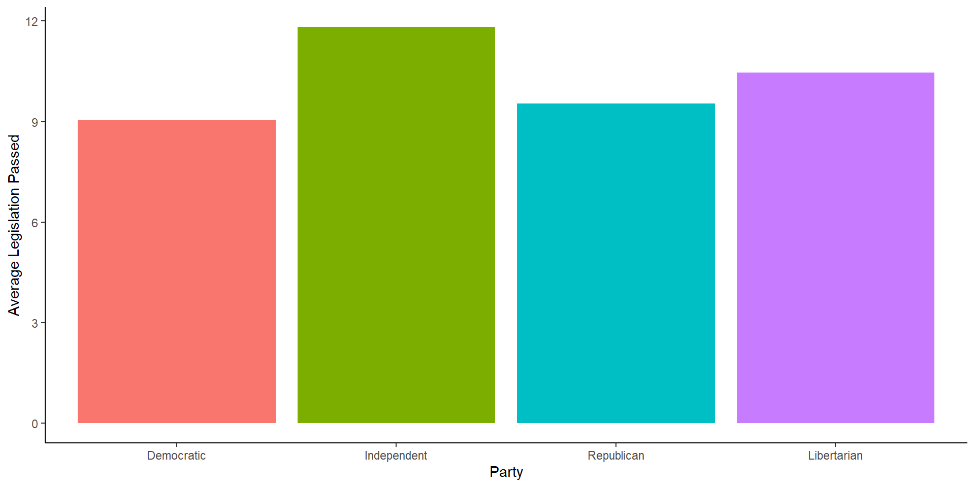
Actually Using ggplot Code

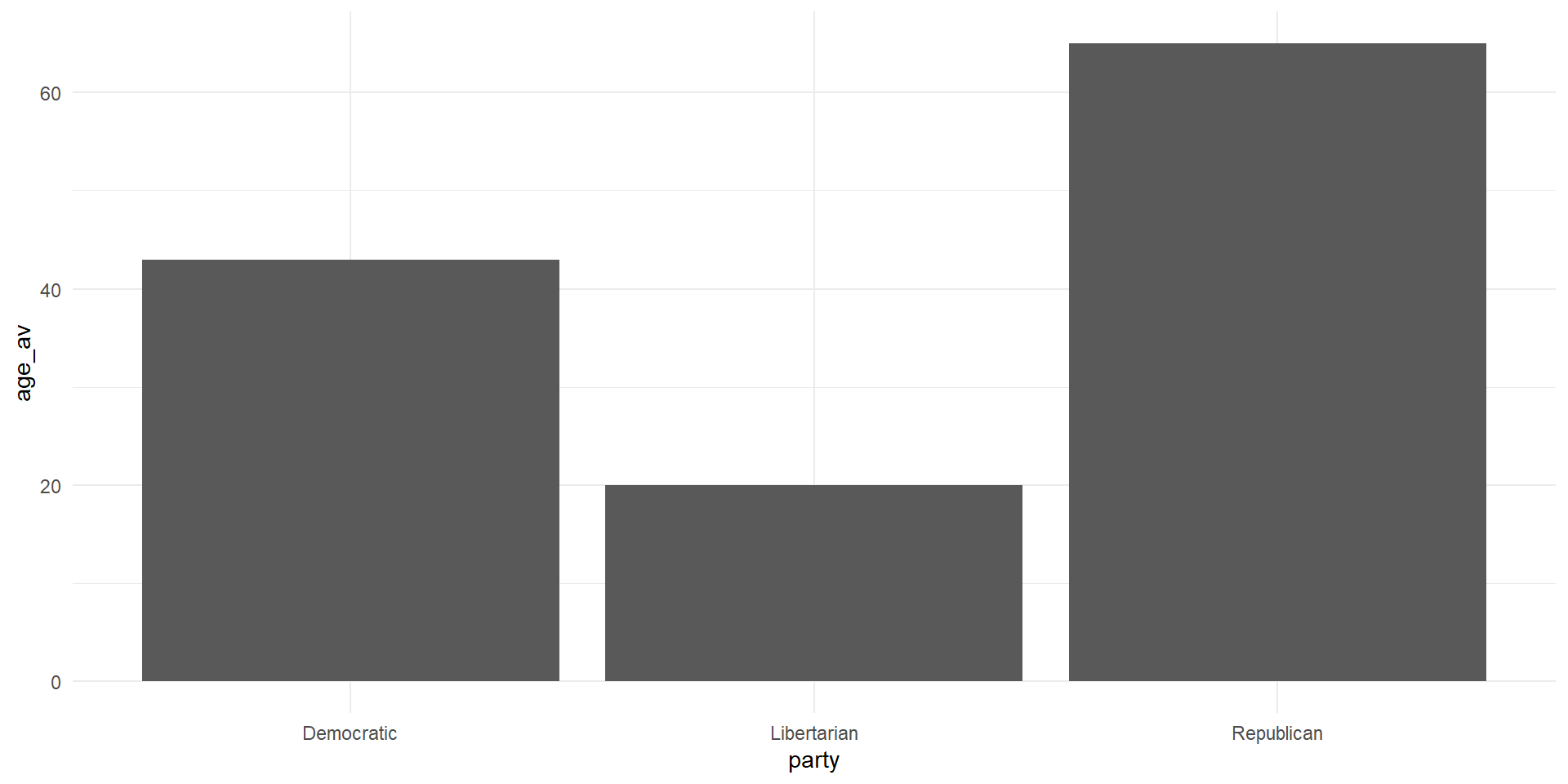
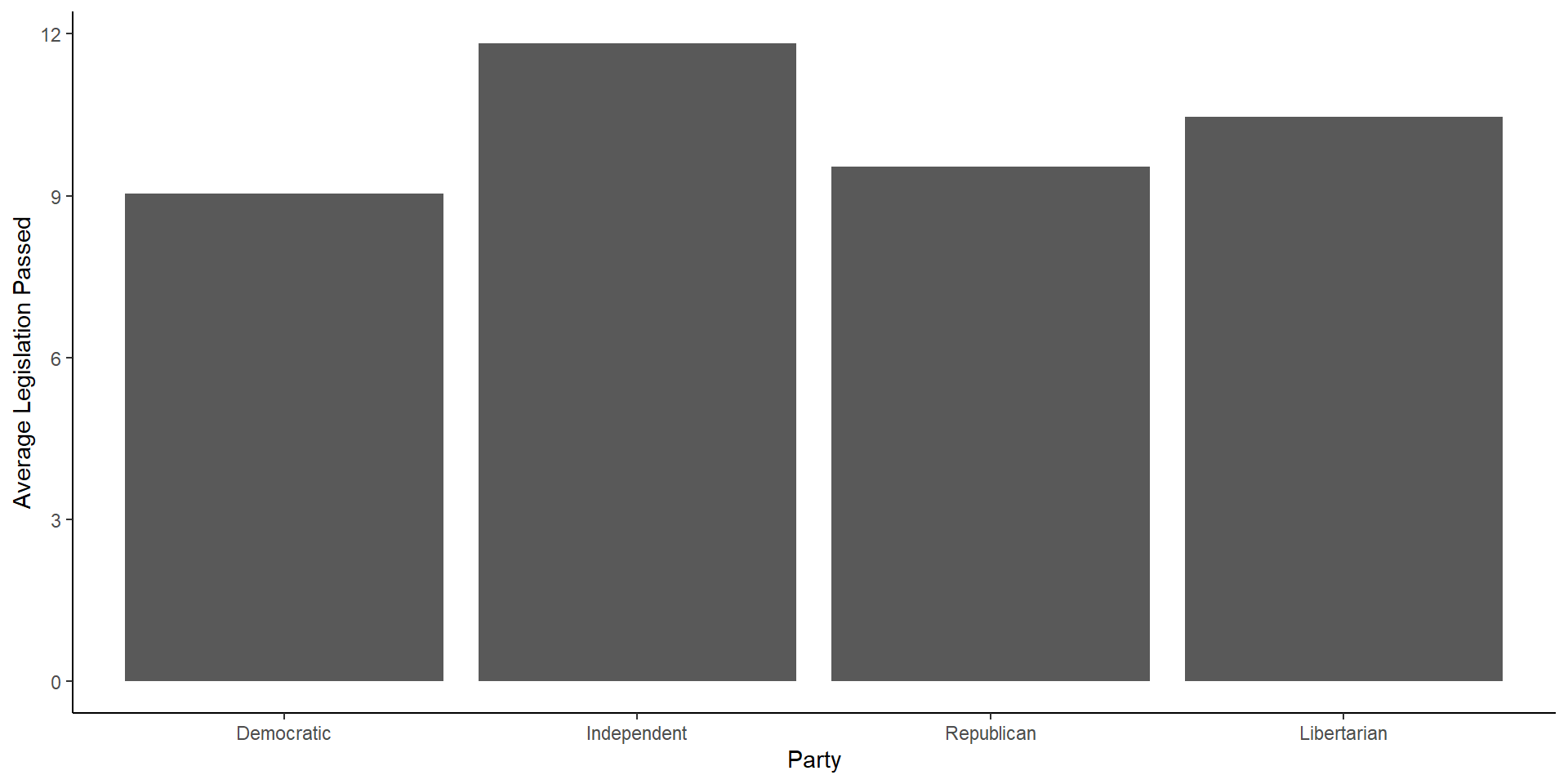
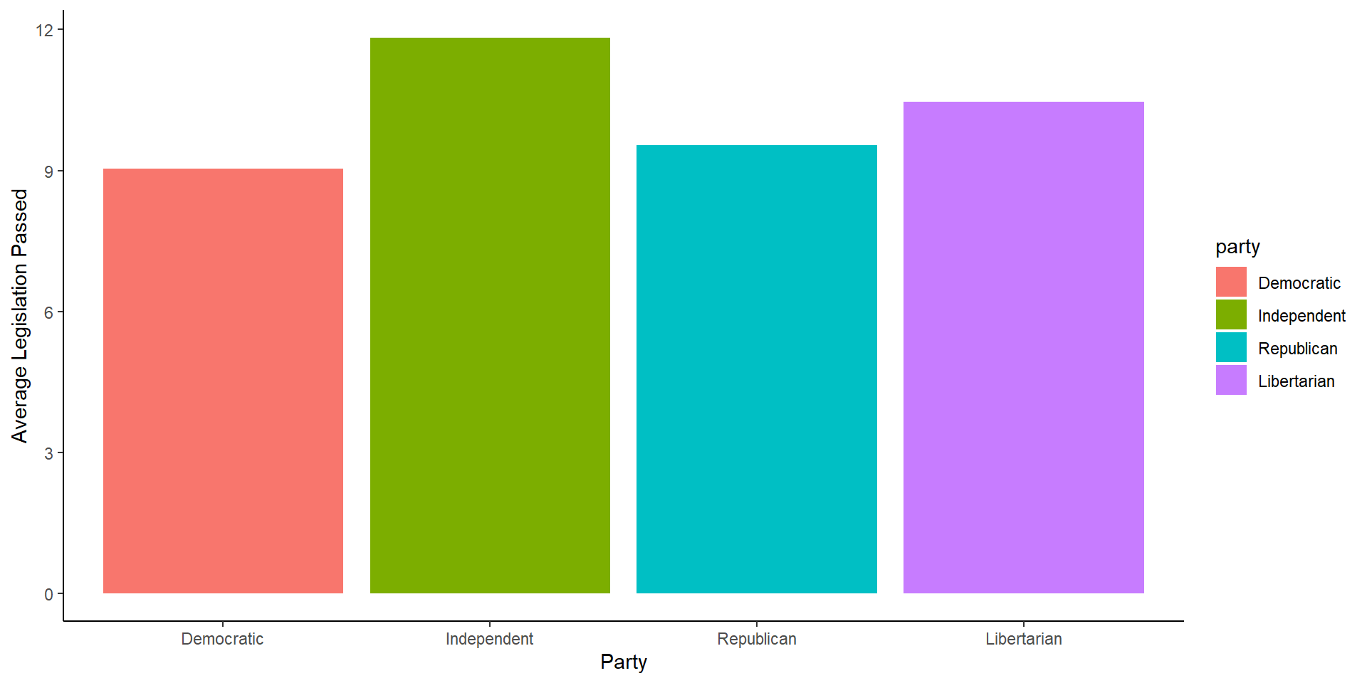
  • There are many ways to graph an average using ggplot, for now, we can use the code from above on finding a group average and go from there
real_congress %>% 
  group_by(party) %>% 
  summarize(age_av = mean(age)) %>% 
  ggplot(aes(x = party, y = age_av))+
  geom_bar(stat = 'identity')+
  theme_minimal()
  • Note that within geom_bar() we had to set stat to “identity”

A Graph

What’re some ways we can make this figure more appealing?

Ways to Improve the Figure

  1. Change the axis labels to something that makes sense
  2. Add color to each bar
  3. Maybe we want a title?
  4. A caption of where the data is from?

A Density Plot

cong_data <- read_csv('live_coding_1.csv') %>% 
  janitor::clean_names()

cong_data %>% 
  ggplot(aes(x = politician_age))+
  geom_density()+
  theme_bw()

Another Bar Graph

cong_data %>% 
  mutate(party = factor(political_affiliation,
                        levels = c('Democratic',
                                   'Independent',
                                   'Republican',
                                   'Libertarian'))) %>% 
  group_by(party) %>% 
  summarize(avg = mean(legislation_passed)) %>% 
  ggplot(aes(x = party, y = avg))+
  geom_bar(stat = 'identity')+
  labs(x = 'Party', y = 'Average Legislation Passed')+
  theme_classic()

Another Bar Graph

A Touch of Color

cong_data %>% 
  mutate(party = factor(political_affiliation,
                        levels = c('Democratic',
                                   'Independent',
                                   'Republican',
                                   'Libertarian'))) %>% 
  group_by(party) %>% 
  summarize(avg = mean(legislation_passed)) %>% 
  ggplot(aes(x = party, y = avg, fill = party))+
  geom_bar(stat = 'identity')+
  labs(x = 'Party', y = 'Average Legislation Passed')+
  theme_classic()

A Touch of Color

Removing the Legend

cong_data %>% 
  mutate(party = factor(political_affiliation,
                        levels = c('Democratic',
                                   'Independent',
                                   'Republican',
                                   'Libertarian'))) %>% 
  group_by(party) %>% 
  summarize(avg = mean(legislation_passed)) %>% 
  ggplot(aes(x = party, y = avg, fill = party))+
  geom_bar(stat = 'identity')+
  labs(x = 'Party', y = 'Average Legislation Passed')+
  theme_classic()+
  theme(legend.position = 'none')

Removing the Legend

Scatter Plots

  • Scatter plots are useful if we have two continuous variables and we want to show their relationship
    • We can also make line graphs, but scatter plots show us what the observations look like as well as the general relationship
cong_data %>% 
  ggplot(aes(x = politician_age, y = votes_received))+
  geom_point()+
  labs(y = 'Votes', x = 'Age')+
  theme_minimal()

Scatter Plots

Scatter Plot Size

cong_data %>% 
  ggplot(aes(x = politician_age, y = votes_received))+
  geom_point(size = 3)+
  labs(y = 'Votes', x = 'Age')+
  theme_minimal()

Scatter Plot Size

Live Coding 2

Let’s make a pretty picture (if we have time)

Live Coding 2

Let’s try to think of some ways to visualize this data.